Using SAT Reporting
![]() Updated 1 year ago
by
admin
Updated 1 year ago
by
admin
Below is a short guide that explains the reporting features of the Security Awareness Training (SAT) product.
- Navigate to the USS dashboard
- Select Products then select SAT - Administration
- Select the Reports icon as shown below:
Summary
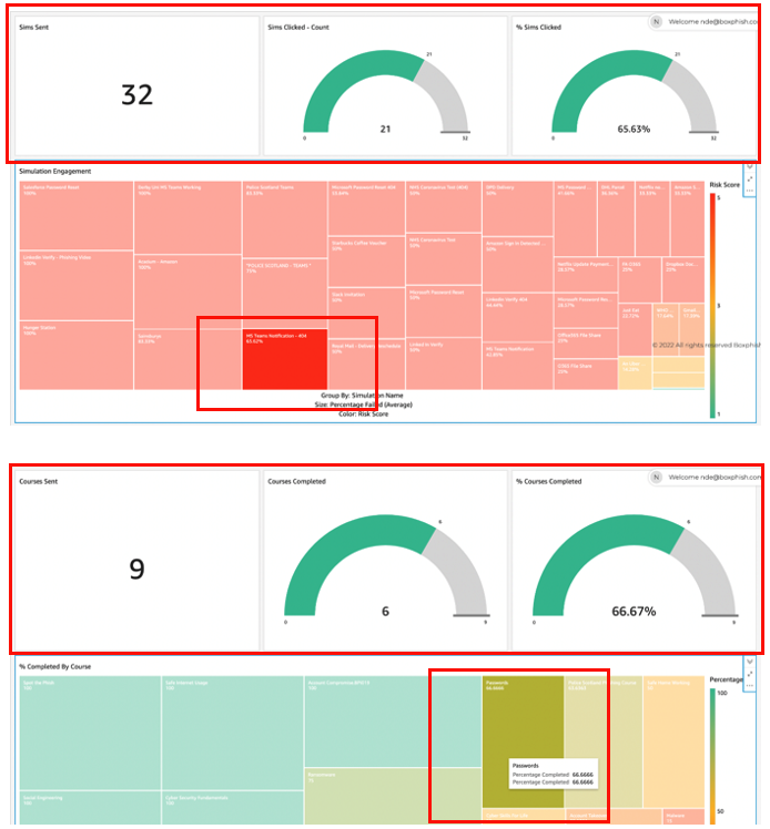
Once logged in to the portal you will be presented with 4 tabs: Summary, Simulations, Courses and Audit Report.
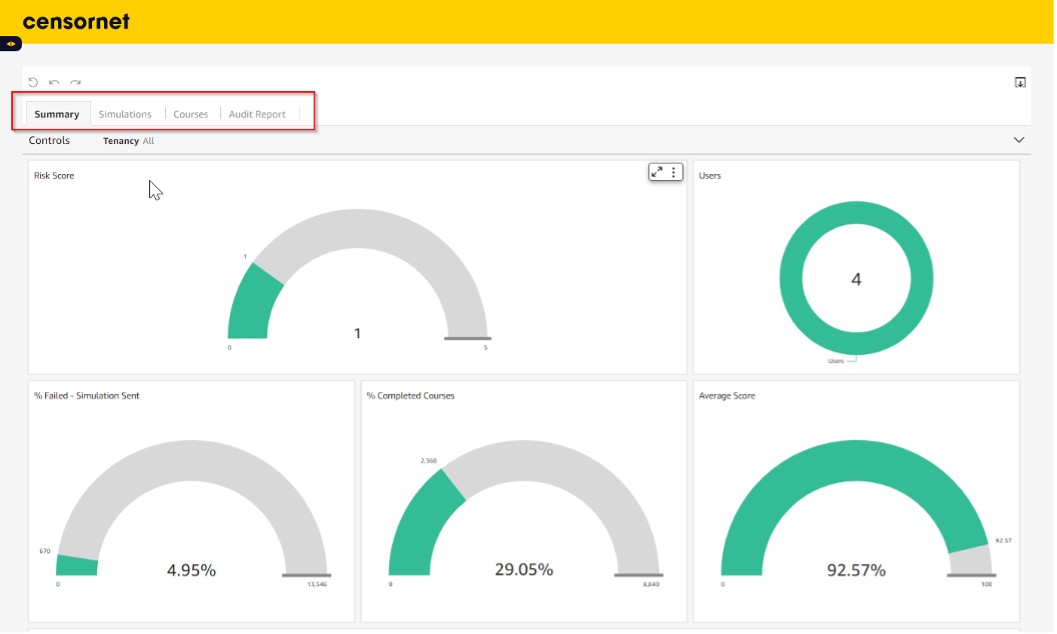
The Summary tab provides high-level metrics looking at your Risk Score, Active Users Enrolled, % fail rate on simulations, % courses completed and the average score on the assessments at the end of the courses.
How is the Risk Score calculated?
All of the reporting contains a Human Risk Score, and this is calculated based on the following:
Calculated on % of simulations clicked
Risk Score 5 - over 20%
Risk Score 4 - over 15% and under 20%
Risk Score 3 - over 10% and under 15%
Risk Score 2 - over 5% and under 9.999%
Risk Score 1 - Below 5%
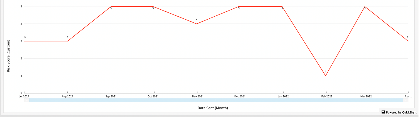
Historical Risk Score
You can view a historical risk score via the graph at the bottom of the dashboard. This shows a summary and trailing Risk Score by month.
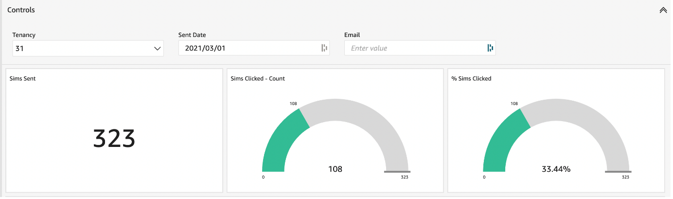
Filtering the data by Date
Should you want to look at reports from a certain date you can select the date from the Sent drop-down. The date you select will show you all activity from the date selected to the current date. This feature is only available within the Simulations and Courses tab.

Filtering the data by Email
Should you want to filter the results for a specific user, this can be achieved by typing an exact match of the user's email in the input field called Email. An example is shown below:
Filtering by Simulation or Course
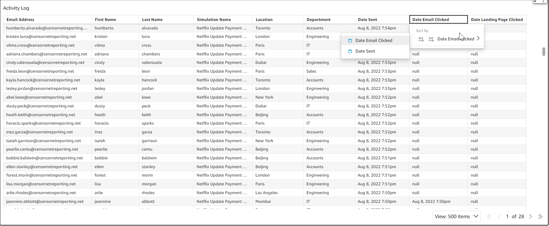
Filtering the data by a single simulation or course is possible. This is achieved by going to the tab you want to see the results for i.e. Simulation or Course. You then need to select from the “Tree Diagram / Heatmap” the simulation or course that you want to view. The summary dials at the top of the dashboard will update accordingly along with the activity log (which can be found at the bottom of the dashboard). To revert back to the original data, simply deselect the activity that has been highlighted. Two examples are shown below:
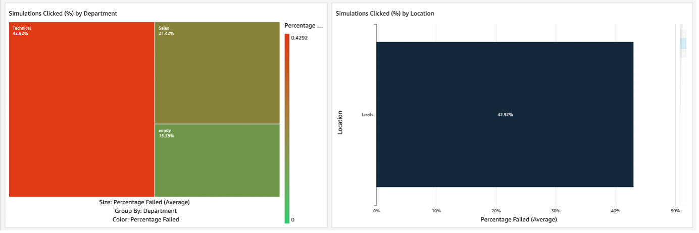
Department & Location
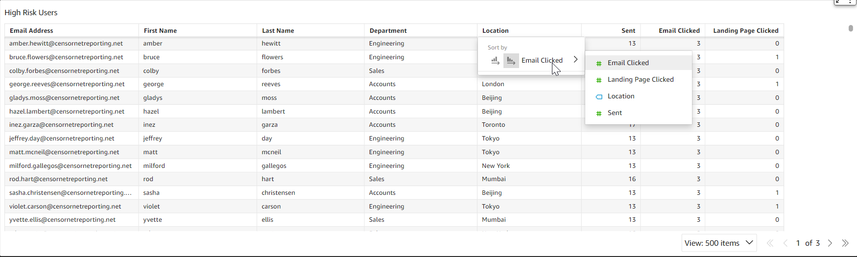
If you use the Department and Location reporting fields you can select to view data relevant to those specific areas. To see department or location-specific data, simply click the department or location that you wish to view and the gauges and the activity log will update accordingly.
Individual User History
From time to time it may be useful to see a specific user’s history for simulations. This can be achieved by using the email search filter or alternatively simply clicking the user's email in the High Risk Users table. All data in the gauges and activity log will update to show the selected user's history.
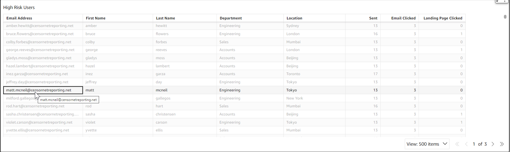
High Risk User List
Exporting The Data
You are able to export the data by selecting the three dots in the top right-hand corner and pressing Export to CSV or Excel, depending on the format you require.
PDF Reports
PDF reports can be generated by selecting the printer in the top right-hand side and then selecting Download as PDF.
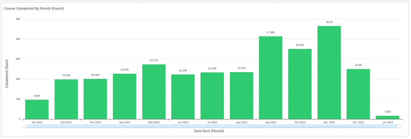
Course completed by month
In the courses tab, you will see a graph labelled Course Completed by Month (Count).
This shows how many courses have been completed within each month in the last 13 months. Using this you can see user completion trends.
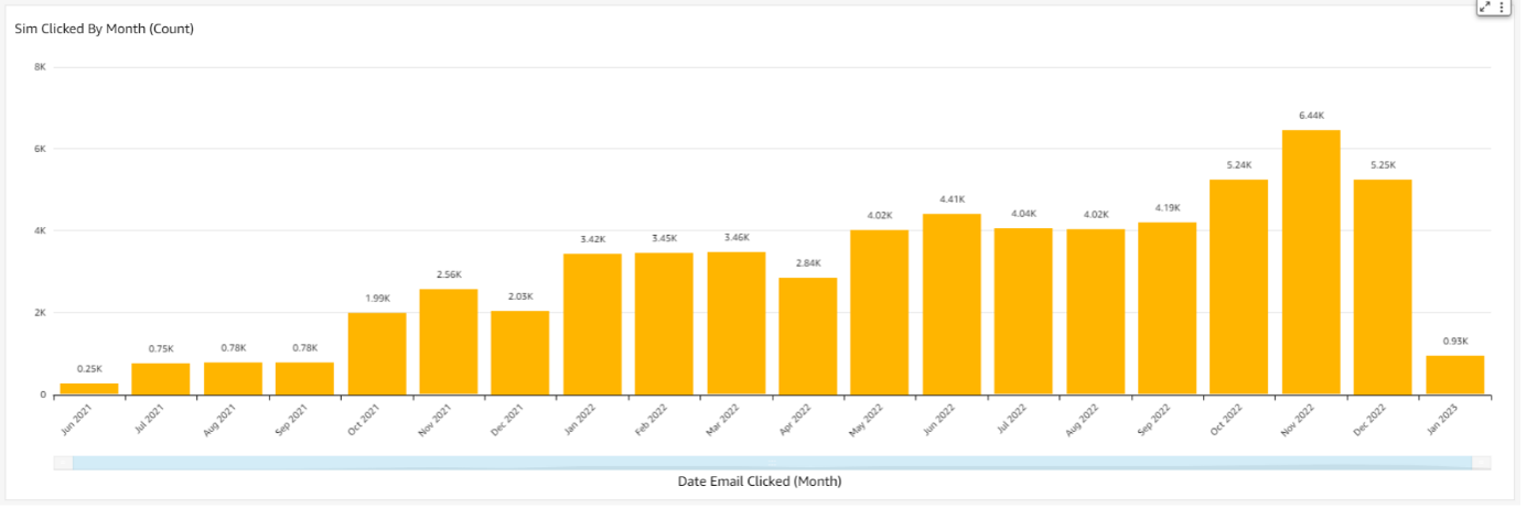
Sim Clicks by Month
In the Simulations tab you will see a graph labelled Sim Clicked by Month (Count).
This shows how many courses have been completed within each month in the last 13 months. Using this you can see click trends throughout the year.
Audit Report
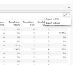
The Audit Report is a graph that shows a complete overview of all user activity. This includes metrics such as Courses Sent, Courses completed, Courses Outstanding, Simulations sent, Simulations Clicked and Simulation Click Rate %.
This can be used to identify any trends between the number of simulations clicked against how many courses have been assigned and completed.
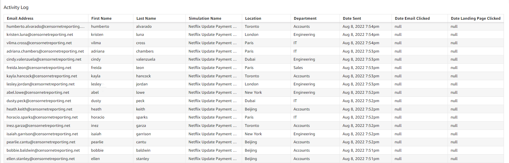
This data is fully exportable through CSV Export. This is located in the three dot menu in the the top right of the table. An example is shown below: